 Often in building a website the first challenge is to find a visual anchor-point capable of expressing your unique message and style. With menu buttons, plug-ins, and other high technology, how do you keep a human touch that is warm and individual? A distinctive handwritten signature can be an excellent place to start. Handwriting and any accompanying doodles have movement, gesture, and other idiosyncrasies that can be explored and amplified to develop your banner or logo, color scheme, and graphic treatment. In this post, I’d like to show you how!
I recently did a custom WordPress site for Laura Haferkorn, an author and lay minister now in her mid-seventies. Laura wanted a website where she could publish a lifetime’s worth of writings, including short stories, essays, sermons, talks, and murder mystery novels. Laura is an extraordinary client in a couple of ways. First, she is a visionary. Most people in her generation might do a tad of web surfing or email, maybe a little Skype with grandkids — but most are a little techophobic. (Hey, not their fault! You might be too, if you grew up in fear of someone detonating an atomic bomb with a single push of a button.) Laura, contrary to the pack, dove in and studied the web’s unprecedented technologies. She came up with the goal to use new tools reach a larger audience and interact with readers as she wrote. Inspired by serial literature, Laura decided to release her murder mystery novel in weekly installments. This approach would build interest and suspense.
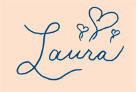 Besides being a Visionary, the second way Laura was an unusual client is because her work encompasses both the sacred (sermons) and the profane (murder mysteries). In seeking a starting point for a logo and banner, I remembered Laura’s signature from many greeting cards she sent over the years. Laura signs her name with open loops and three small hearts whose long tails suggest the festive balloons sold with greeting cards. I asked Laura to write her signature as large as she could on a clean piece of paper for scanning.
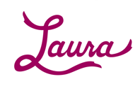 I spent some time just studying the signature, to see what symbolism it might suggest that fit her intentions. Since Laura’s work spans both light and darkness, a ribbon seemed meaningful. To start, the ribbon relates to writing when used as a bookmark. Ribbons express the goodness of a minister’s care when they appear in garments and spiritual icons. Ribbons also mean care when they appear in gift wrappings and decorative balloons. Yet ribbons relate to rope and acquire a sinister meaning if used as a murder weapon for strangulation or hanging.
The ribbon fit easily into Laura’s signature loops. To convey these disparate good and evil meanings, the next step was to search for color. A dark pinkish red color seemed right on the line between the minister’s care and spilled blood. A background color that looked like parchment or aged paper amplified the personal, handwritten theme. Combined with the red, it became the anchor for the website’s color scheme.
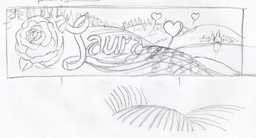 As the project unfolded, I considered the balloons. They evoked a message being sent, or possibly an old-fashioned balloon voyage to a distant place. A landscape emerged in my visualization process, but which one? I re-read Laura’s murder mystery, “The Trouble With Some People.” The fictitious village of Bickerton from this book seemed like the perfect setting! Bickerton is on the north shore of a lake (Lake Ontario?), surrounded by forests, fertile fields and meadows, and neighboring villages. I did a quick pencil sketch to see if the idea would work, and the answer was YES!
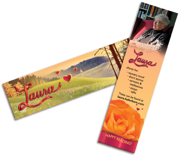
As I began illustrating, I mused over the point of view. Since the mystery novel involves a body found in the woods, I framed the landscape as though we are high on the lake shore, looking out over the bay from somewhere without any buildings. The idea was to hint we may be close to where a body might be found (at least for readers “in the know”!). I deliberately created some dead ghostly trees to keep the undertone of mystery. Because Laura’s sermons also had to be incorporated, a church seemed important: a place of hope and redemption to balance the sinister tones! The little white wooden church became a visual focus for the fictitious town of Bickerton across the bay.

With any creative project, there are successes and failures. As I worked on the illustration, I kept focusing on how to feature Laura’s signature and make a landscape that was timeless. The original pencil sketch shows a large red or orange rose in the banner, since roses are a topic of Laura’s expertise. In the end, it proved too distracting: the ribbon “Laura” signature and the balloons were enough. To emphasize the three-dimensional landscape, I did a preliminary version with vineyards, which turned out to be too complicated for the client’s taste. Instead, I followed the client’s instructions for “the field to be more of a meadow than rows, in shades of green, no brown.” The meadow softened the landscape and made Bickerton a more inviting place. Now I had a “timeless” landscape with elements from spring (wildflowers), summer (water), and fall (dead trees). Funny how the client IS always right! Because I used to design flying logos for TV, I have learned a thing or two about getting people to “stay tuned.” On the web, when people love a home page banner and feel good about it, they WILL RETURN, as Laura’s visitors have proven.

So there you have it. The starting point of a whole WordPress website can come from something as simple as an old-style signature in pen and ink!
If you liked this post, please subscribe at the top right for more “making-of” stories — to help YOU build the website of YOUR dreams!
Comments on this entry are closed.
I loved reading the explanation of Laura’s web banner design. It changed my whole perspective of it! Plus, gave me some kernels of my own ideas to share with you as you develop one for my web site.