Designing characters—especially villainous characters—is one of the most fun challenges for an illustrator. Pain and Panic from Disney’s Hercules, Boris Badenov and Natasha Fatale of Rocky & Bullwinkle, Popeye’s Bluto, and the demon Chernabog from Night on Bald Mountain are some of my favorites. After introducing hundreds of SVA and Pratt students to the bad-guys and bad-girls of animation, you can imagine my delight at being asked to create characters for a CD named nothing less than ‘Evil Ballads’!
Would a Smokin’ Poppy character be bad enough…or TOO evil…for ‘Evil Ballads’?
Singer, songwriter and vocal teacher Sarah Townes’ concept was to have me illustrate a series of “bad” characters embodied as flowers: a twist on Cicely Mark Barker’’s flower fairies.

Cicely Mary Barker’s Willow and Canterbury Bell flower fairies are a conceptual starting point for character design.
She described her songs as having rather dark lyrics about despicable human behavior. Having lived in New York City, I could imagine lots of different “bad-ass” types: embezzlers, sociopaths, meth addicts, and so on. I’ve also grown flowers and plants and know of some nasty ones: poison ivy, oleander, narcissus, hemlock…so I felt confident I could come up with suitable antagonists for the cover art. Still, not having heard any of the ‘Evil Ballads’ music, and faced with the empty drawing board, I was unsure how exactly to interpret the idea of “evil.” Would a Skeleton Pirate Chrysanthemum, a Smokin’ Poppy, or a Tongue-Pierced Tigerlily hit the mark—or overshoot it?
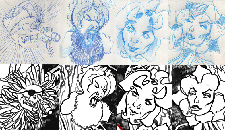
TOO EVIL! Some of the early character designs that were eliminated or softened for the final CD cover include:
(L to R, pencil at top with pen and ink below) Skeleton Pirate Chrysanthemum, Ragin’ Bearded Iris, Evil Orchid, and Cussin’ Columbine.
At a meeting to present rough sketches, Sarah made it clear that the CD cover needed a tiny tinge of badness, not outright EVIL. This is Boulder, Colorado, after all—home of Celestial Seasonings teas, earth-friendly Crocs, and Sounds True audio recordings for inner enlightenment! Sarah related to the more tame female characters I presented, so I threw out the sinister males and set to work honing bad-girls, misfit punks, and smirking floral faces.
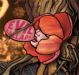
Bubble Delinquent
In the end, I decided to put only one character on the CD front. Bubble Delinquent is based on a globe flower, which was attractive for reasons other than poison. Bubble is the kind of girl who survived an adult’s improper fondling as a child. She drapes herself in bulky sweats and a beat-up hoodie, irreverently cracking gum and refusing to talk when spoken to. The globe flower’s dense rounded petals became a safe but shroud-like hood from which the character—or at least her bubble—could peek.
I like to photograph Nature’s spectacles and textures and use these images in my digital illustration process. I give considerable thought to the symbolism and meaning of each element in an illustration. Because ‘Evil Ballads’ deals with profound issues, including the Environment, I was drawn to work with textures from the Earth. Sarah had responded to softer, more feminine ideas about flowers, so I chose rose quartz for Bubble Delinquent’s skin.
I treated each petal of her “hood” as a separate object and borrowed a technique from 3D modeling called texture-mapping, where a photo or hand-painted image is stretched over the petal’s surface to give it color and texture. I had close-up photos of an enormous red hibiscus and a coral-hued bouganvillea from one of my indoor gardens. After positioning and liquifying these images in Photoshop, I hand-painted shadows and highlights to increase the 3D illusion.
On a graphic design note, initially I had the CD title beside Bubble Delinquent. Sarah had the brilliant idea to put ‘Evil Ballads’ right inside the bubblegum. She also wanted a stroke through the CD title, in the manner of a sign that bans, say, skateboarding or smoking. I interpreted the stroke-through as a root tendril from the tree—but more about that shortly.
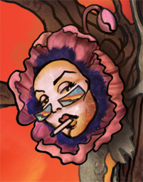
Smokin’ Poppy
A poppy flower was an obvious choice for ‘Evil Ballads’ because it’s the source of opium. Smokin’ Poppy is part 1950’s B-movie heroine and part ski bunny, all glam-cool, insecure and wanna-be. I gave her psychedelic eye-shades of turquoise and pyrite or “fool’s gold” and a face of smokey quartz with rust-colored impurities. For the petal textures, I placed images of crepe silk using the texture-mapping method mentioned above. Click here to see her close-up.
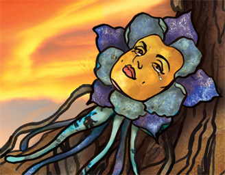
Cryin’ Columbine
There’s nothing toxic about Colorado’s state flower columbine, so I explored an introspective angle on “badness.” Inside every “bad girl” (or “bad boy,” for that matter!), there is a hurt and crying child. Sarah sent me her CD tracks while I worked. By the time I designed Cryin’ Columbine, I had steeped myself in the raw honesty of heartbreaking love in ‘Please’ and a slave woman’s search for her brother in ‘Lost And Found.’
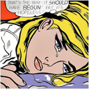
Sarah’s powerful renditions had me crying out loud. Big comic-book tears like a Roy Lichtenstein heroine’s seemed in order. Cryin’ Columbine’s textures are lapis lazuli, turquoise, and smokey quartz.
Oh NO! Orchid
The original design for Oh NO! Orchid was malevolent, compared to the revised merely mischievous character. Initially, I was drawn to the orchid as a potential flower face for its devilish horns and wicked goatee. I’d once read a New York Times article on a bearded woman. The more I thought about it, the more it seemed that sideshow acts are both tragic and tough—a metaphor for the characters in ‘Evil Ballads.’ Oh NO! Orchid started out as a circus freak with horns and a third eye, but in the end became a sneaky and crafty outsider, the classic street-smart vagabond, the trouble-maker.
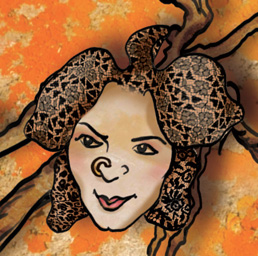
On songs like the standard ‘You Don’t Know What Love Is’ and the uplifting Gospel-like anthem ‘Come Around,’ Sarah’s voice exudes soul, hard livin’, and sexy sweetness that speaks to me of…lingerie. Well, what else was there to do but stretch black lace stockings over Oh NO! Orchid’s petals?!
Tauntin’ Tigerlily
The inspiration for the last character, Tauntin’ Tigerlily, comes from the rap-like ‘Peel,’ which I’d heard Sarah perform in concert. The song is as strikingly original, unforgettably rhythmic, and almost nursery-rhyme-catchy as Suzanne Vega’s ‘Tom’s Diner.’
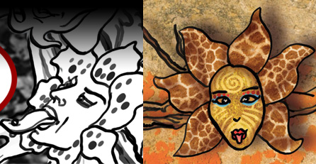
What started out as a long pierced tongue turned into a crazy face for Tauntin’ Tigerlily. I used giraffe skin texture for the character’s petals, gold leaf and tattoo-like face paint to go along with crossed eyes and the stuck-out tongue. Her attitude of challenge reflects ‘Peel’s’ main riff, “Putting the outside before the inside, are we gonna get this inside-out?” Click here for her close-up.
Trees & Backgrounds
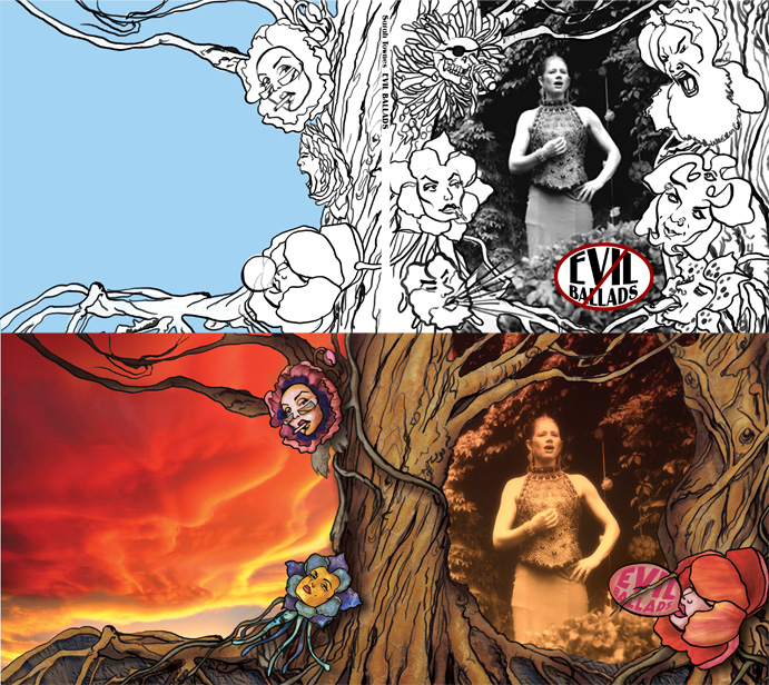
I looked at the fairy tale illustrations of Arthur Rackham and Art Nouveau picture frames while designing the trees that flank Sarah Townes on the CD’s front cover. I also revisited Roger Dean’s Yes album cover artwork from the 1970s and the Hildebrandt Brothers artwork for Lord of the Rings from that same period. I liked the stylized forms and textural interpretations of space these artists used, and worked toward something similar for ‘Evil Ballads.’

Illustrations by Arthur Rackham, Roger Dean, and the Hildebrandt Brothers inspired the style of trees in ‘Evil Ballads.’
The trees and their tangled roots and branches became a major character of the CD packaging design. They formed a transition from the front cover to the back and a way to connect the five flower characters on the CD itself. I used the idea of twisted curling roots combined with the eddying cadences of Sarah’s music to set type on a path for the musician credits.

Photos I took of the North Boulder sky during a storm, orange lichen near Estes Park, and a red hibiscus were textures for the flowers and background images.
When it came to backgrounds, I used a photo of the North Boulder sky during a storm which had the most phenomenal clouds I’ve ever seen. These anguished colors inspired me to tint the original black and white photo of Sarah Townes singing ‘Ave Maria’ at her friends’ wedding. As the package design and color palette came together, one of the last steps was coming up with a background for the CD. I had taken a photo of orange lichen that grew along one of the trails in Rocky Mountain National Monument, about an hour north of Boulder. Lichen seemed like the perfect metaphor for the characters of ‘Evil Ballads.’ She has to be strong enough to penetrate rock, takes decades to grow to dime-sized, and provides an enduring foothold for life forms to follow—like the wronged but fiercely tenacious heroines of Sarah Townes’s songs!
For the final typographic treatment, please visit my portfolio.
For additional projects, I invite you to my home page.
I welcome your comments below.
Sonya Shannon
Lafayette, Colorado



Comments on this entry are closed.
Sonya,
I do like the villain characters, I know it depends on the sound of the music, which I haven’t heard yet, but I like the edge-i-ness of those characters, especially given the title of the album.
Wow, Sonya, you’ve outdone yourself for … what is this … the umpteenth time! What a stunning piece of work! I love the fact that you used the ‘Flower Fairies’ by Cicely Mary Barker as inspiration. Her illustrations show what we usually think of when we look at flowers in a garden – glorious colour and serene beauty. You’ve turned this on its head and shown us the opposite side of their character – the dark, often disturbing, and nasty one. Anyone who has ever had an encounter with a poisonous plant will be able to relate – Crown of Thorns, stinging nettle, Deadly Nightshade (but it has such darling little purple and orange blooms!), Goat’s Beard … I could go on. Now I plan to listen to the ‘evil’ music!
Thanks so much for sharing how you arrived at the concept and how you brought it to life.
Laura
What an amazing artist you are! It makes all the difference in the world to hear HOW you created these bad-ass blossoms. My favorite is definitely Oh NO! Orchid. From her black-lace locks to her ‘bring it on’ stare, she exudes exoticism and orneriness — the very essence of orchids. Well done…and well received, I’m sure! Can’t wait to hear the bouquet of evil ballads.
hi sonya!
wow! that looks like a really fun project you worked on! it was funny to hear that some flowers, especially the male villains, could be considered “too bad” to be included with the evil ballads, so they had to be ruled out! i never knew your creative processes, were so complex..very interesting to hear! i liked how you referenced your experiences of living in new york city and translated what you saw of the bad sorts of people, into an art form. truly inspirational! many thanks!
stasia
Inspired interpretations of actual species to express affects not usually associated with flowers in our culture. Each character radiates a vividly unique personality energized by a tension between her beautiful visage and her untoward demeanor.
Imaginative concept superbly executed with care and refinement. Demonstrates impressive talent, refined skill and hard work. The outstandingly strong individual elements are well integrated into a unified design.
Thank you for the articulate insight into your creative process and the delightfully irreverent result.
Wow! That was really fascinating to read about the process of creating these characters! All of the thought and intention put into it really shows. The characters seem alive, like real people with a haunting past. The one that I gravitated toward most was Cryin’ Columbine. She’s so tender, but at the same time cold and hardened. The incredible moody clouds behind her just intensify the mystery- I wonder what she’s feeling, and at the same time feel I have been in her shoes- or petals! Also, the Columbine always brings me back to the tragedy of the Columbine High School shootings and I remember the deep feeling of loss. I just love how totally unique each flower is – this is amazing work. I think it’s brilliant the way you framed the cover with the tree and branches. It all flows together so well. Thanks so much for sharing the journey of this creation!
Sonya –
My favorite character is Smokin’ Poppy. I enjoy the subtlety to her expression, also, great glasses. Also, the amount of inspiration you take from nature. It looks like this a really fun job for you. Also, thanks so much for sharing the process. It is so rare that artists share details of their inspirations and thoughts about how they develop their ideas. it is such a lovely expression of your generosity!